Maximise engagement with TWX-Chat’s Avatar Chatbots. Discover innovative ways to bring personality to your website.
Users will love interacting with your Avatar Chatbots far more than standard Text-Bots. Watch as they relax a little more, have a giggle, and get thoroughly engaged chatting along with Cristine (‘Charlie’ on this website) or Luke or any of the other characters TWX-Chat offers, with many more to come in the future!
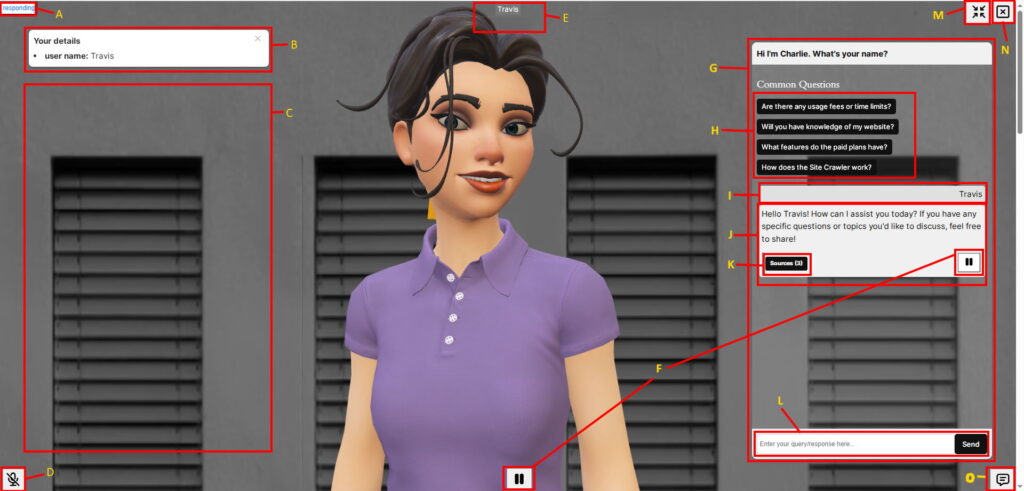
Anatomy
- A – Status indicator. This shows what the Avatar is currently doing
- greeting – when greeting the User at the start of the conversation
- listening – while the User speaks
- thinking – performing user query to LLM and Knowledge Base etc
- responding – while the Avatar speaks (or is Paused)
- idle – All other times
- B – User Fields flashcard. If User Fields and User Fields Title are enabled in a Chatbot (Plus plan and above), as they are identified by the Chatbot, they will be displayed in this area.
- C – Flashcards area. If Flashcards are enabled in the Chatbot settings, they will appear for a short while here showing relevant Sources to the last User input. Images may appear also inside these cards if they exist at the Source.
- D – Microphone enable/disable. User can click this to Mute the microphone or interrupt the speaking Avatar. On some devices (like Android) the Microphone is automatically turned off after a few seconds if user speech is not detected. This is a limitation of that platform at present. On Windows Chrome browser the Microphone may be disabled during the Avatar speech in order to avoid ‘hearing itself’. Again this is a limitation of that platform. Safari on iOS seems ok listening at all times and can handle interruptions.
- E – User speech-to-text. Displays User speech as it is spoken. It is cleared before each interaction.
- F – Avatar Resume/Pause speech buttons. The User can also re-play previous Chatbot responses from within the Conversation Panel.
- G – Conversation Panel. This can be shown/hidden using the button (O) below.
- H – Common Questions. If these are configured in the Chatbot Settings, they will appear here. If clicked, a query to the Chatbot is made just like the User asked that question (ie: captured in the Chat Log etc).
- I – Previous User inputs (right aligned) are shown here.
- J – Bot Responses/questions (left aligned) are displayed here. If Streaming is enabled in the Chatbot Settings the stream will ‘type’ in here as received otherwise an animated icon shows until the response is fully received.
- K – Sources button. If Sources from the Knowledge Base are used in the Bot Response the number of Sources will show inside the button. Click to show/hide Source links. If Users click a hyperlink a new browser tab is opened at that location, and the click is recorded in the Chat Log. If Google Analytics is present on the page, an event of type ‘twxchat_source_click’ is also sent to GA.
- L – User text entry area and Send button. This is an alternative to using the Microphone for user input and is also handy when entering details such as email addresses etc.
- M – Minimise / Maximise button. If the Avatar Chatbot style is ‘Floating’, this toggles between Full screen and Floating view.
- N – Exit Button. User clicks this to Exit out of the Chatbot conversation returning to the Avatar Splash image.
- O – Show/hide Conversation Panel. On smaller screen mobile devices this will be placed over the top of the Avatar to allow reading and input.